Product Data Management is Like an Ironman

cofToday we have an Ironman passing through the streets of Copenhagen (and my breakfast). Kudos to the women and men who first have been on a swim lane of 3.86 km (2.4 miles), now is cycling 180.25 km (112 miles) and then will run a full Marathon of 42.2 km (26.22 miles).

Thinking about it doing product data management is a bit like an Ironman too. Overall it is a daunting task. And we have three disciplines to cover:

  • Digital Asset Management (DAM) is an activity where many organizations start. It is about handling product images in various sizes and versions along the way, as well as, depending on the product category, installation guides, line drawings, data sheets and other documents. Also videos with that and other content is becoming popular.
  • Product Information Management (PIM) is about maintaining hundreds (sometimes thousands) of different attributes describing a product. Some of these attributes are common for most products (like height, weight and colour) and some are very specific for a given product category.
  • Master Data Management (MDM) is a Marathon in itself. Here you link the above product data with product data in the overall system landscape including ERP, SCM (Supply Chain Management) and PLM (Product Lifecycle Management). Product data also forms the product domain that must be aligned with the location domain, asset domain, party domain and perhaps other domains in your MDM world.

How these disciplines stick together within your organization and your digital ecosystem was further examined in the post How MDM, PIM and DAM Stick Together.

Fitness, Data Quality, Big Data and IT Projects

This weekend I’m in Copenhagen where I, opposite to when in London, enjoy a bicycle ride.

In the old days I had a small cycle computer that gave you a few key performance indicators about your ride as time of riding, distance covered, average and maximum speed. Today you can use an app on your smartphone and along the way have current figures displayed on your smartwatch.

As explained in the post American Exceptionalism in Data Management the first thing I do when installing an app is to change Fahrenheit to Celsius, date format to an useable one and in this context not at least miles to kilometers.

The cool thing is that the user interface on my smartwatch reports my usual speed in kilometer per hour as miles per hour making me 60 % faster than I used to be. So next year I will join Tour de France making Jens Voigt (aka Der Alte) look like a youngster.

Viking tour
A Viking tour around Roskilde and Vallø Borgring. Click for report with a wonderful mixup of date formats.

Using such an app is also a good example of why we have big data today. The app tracks a lot of data as detailed route on map with x, y and z coordinates, split speed per kilometer and other useful stuff. Analyzing these data tells me Tour de France maybe isn’t a good idea. After what I thought was 100 miles, but was 100 kilometers, my speed went from slow to grandpa.

That’s a bit like IT projects by the way. Regardless of timeframe, they slows down in progress after 80 % of plan has been covered.

Bookmark and Share

Know Your Fan

A variant of the saying “Know Your Customer” for a football club will be “Know Your Fan” and indeed fans are customers when they buy tickets. If they can.

FC Copenhagen

FC Copenhagen cruised into stormy waters when they apparently cancelled all purchases for the upcoming Champions League (European soccer club paramount tournament) clashes against Real Madrid, Juventus and Galatasaray if the purchasers didn’t have a Danish sounding name. The reason was to prevent mixing fans of the different clubs, but surely this poorly thought screening method wasn’t received well among the FC Copenhagen fans not called Jensen, Nielsen or Sørensen.

The story is told in English here on Times of India.

Actually methods of verifying identities are available and cheap in Denmark so I’m surprised to see FC Copenhagen caught offside in this situation.

Bookmark and Share

Data Quality, Professional Cycling Style

Lance ArmstrongThe professional cycling sport has been havocked by the doping ghost during the last years with the confessions from Lance Armstrong as the latest paramount following other confessions for example by fellow Tour de France winner Bjarne Riis.

The word denial is probably the most central term in all this mess. The riders have kept denying the facts past the threshold of absurdity.

We do see a lot of the same kind of denial within the realm of data management where data quality issues obvious to everyone are denied often with the sentiment that of course there are a lot of data quality issues around, but certainly not with my data. My data is clean.

But they ain’t.

Bookmark and Share

Hot and Magic Medal Counting

In the ongoing Olympic Games one often displayed list is the list of medals per nation.

The list reminds me about the occasional analyst report ranking of Data Quality tools and Master Data Management (MDM) solutions. The latest one is fresh pressed as told in the post called Product Information Management is HOT for Business by Ventana Research, where the PIM vendors are ranked with Stibo Systems being the most HOT.

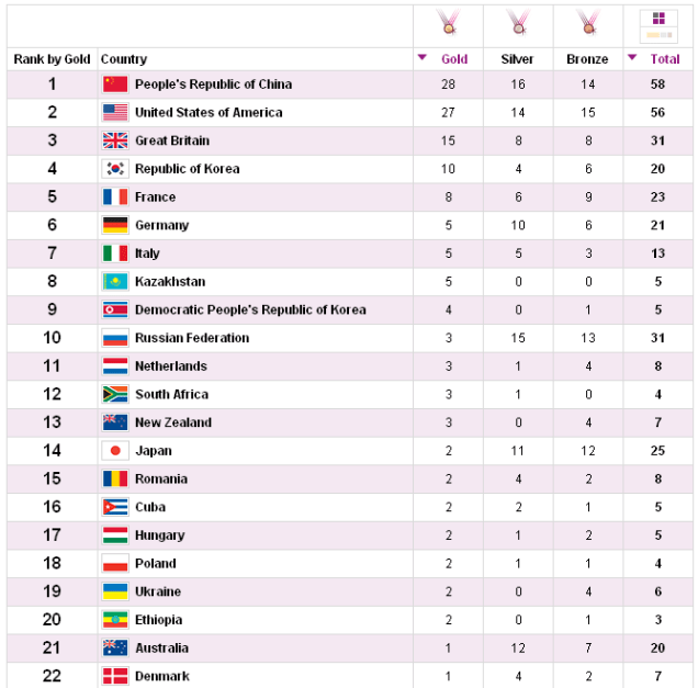
The counting of medals in the Olympic Games in London this afternoon looks like this:

As expected the top race is between the big teams from United States and China just as the mega vendors of tools also always receives good rankings by analysts though with a few exceptions as reported in the post The Data Quality Tool Vendor Difference, where the Gartner MAGIC Quadrant is compared with the ranking from Information Difference.

As often seen the home team, Great Britain and Northern Ireland, is also doing very well. With tools we also see that the Most Times the Home Team Wins despite of analyst ranking when a local client selects a tool.

Other big teams as Russia, Japan and Australia are currently struggling to get more gold medals to climb the list if ranked by gold (instead of total number of medals). Perhaps we will see a closer race with more teams in the last week just as expected with MDM tools as reported in the post Photo Finish in MDM Vendor Race.

The smaller nations often does it better in a small range of disciplines, like Ethiopia in running and Denmark in rowing and sailing resembling the situation described in the post Who is not Using Data Quality MAGIC, as there are plenty of Data Quality tools out there very feasible in certain tasks and local circumstances.

Bookmark and Share

Olympic Moments

The London 2012 Olympic Games is approaching. You feel that very well in London. For example my usual walking path thru Hyde Park is closed because of the upcoming sport event.

I’m sure these games are going to produce some great moments. Some of the moments I’m remembering from previous games have a touch of data quality technology learning attached.

The Fosbury Flop

In 1968 the American athlete Dick Fosbury introduced a better way of doing the high jump. What I find interesting about the Fosbury Flop is that this technique hasn’t always been possible. In the old days the jumpers landed in a sandpit. If you did the flop then, it would certainly be a flop most probably getting you injured after the first attempt. But after deep foam matting was put in place, the flop has been a good choice.

It’s the same with data quality technology. Some techniques for improvement you have found to be a flop previously may because of new circumstances be a good choice today. The high esteemed scissors jump didn’t prevail forever.

Eddie the Eagle

In 1988, at the winter event, a Brit made a lot of headlines by being totally bad at ski jumping. Eddie the Eagle finished not surprisingly far behind natural born Finnish, Norwegian and Czech ski jumpers coming from a country where the first sign of the white fluffy stuff from above isn’t considered a severe weather condition. But Eddie set a new British record.

It’s the same with data quality technology. Some tools and services are leading in some countries, but have a hard time when challenged internationally.

Sailing under Wrong Flag

In the 2008 games something spectacular happened in the sailing competitions. The Danish 49er boat was in first place but broke the mast when leaving the harbor for the last race. The Croatian team offered their boat. The Danes sailed into the race long after the other boats have started, but managed to get a result just good enough to secure the gold. The other teams might have been confused by the wrong flag.

As told in the post Most Times the Home Team Wins flags are important – in sports, in data quality and other data management disciplines too.

2012

What do you guess will make a difference in this year’s Olympic Games? – And in Data Quality improvement?

Bookmark and Share

Sharing Bigger Data

Yesterday I attended an event called Big Data Forum 2012 held in London.

Big data seems to be yet a buzzing term with many definitions. Anyway, surely it is about datasets that are bigger (and more complex) than before.

The Olympics is Going to be Bigger

One session on the big data forum was about how BBC will use big data in covering the upcoming London Olympics on the BBC website.

James Howard who I know as speckled_jim on Twitter told that the bulk of the content on the BBC Sports website is not produced by BBC. The data is sourced from external data providers and actually also the structure of the content is based on the external sources.

So for the Olympics there will be rich content about all the 10,000 athletes coming from all over the world. The BBC editorial stuff will be linked to this content of course emphasizing on the British athletes.

I guess that other broadcasting bodies and sports websites from all over the world will base the bulk of the content from the same sources and then more or less link targeted own produced content in the same way and with their look and feel.

There are some data quality issues related to sourcing such data Jim told. For example you may have your own guideline for how to spell names in other script systems.

I have noticed exactly that issue in the news from major broadcasters. For example BBC spells the new Egyptian president Mursi while CNN says his name is Morsi.

Bigger Data in Party Master Data Management

The postal validation firm Postcode Anywhere recently had a blog post called Big Data – What’s the Big Deal?

The post has the well known sentiment that you may use your resources better by addressing data quality in “small data” rather than fighting with big data and that getting valid addresses in your party master data is a very good place to start.

I can’t agree more about getting valid addresses.

However I also see some opportunities in sharing bigger datasets for valid addresses. For example:

  • The reference dataset for UK addresses typically based on the Royal Mail Postal Address File (PAF) is not that big. But the reference dataset for addresses from all over the world is bigger and more complex. And along with increasing globalization we need valid addresses from all over the world.
  • Rich address reference data will be more and more available. The UK PAF file is not that big. The AddressBase from Ordnance Survey in the UK is bigger and more complex. So are similar location reference data with more information than basic postal attributes from all over world not at least when addressed together.
  • A valid address based on address reference data only tells you if the address is valid, not if the addressee is (still) on the address. Therefore you often need to combine address reference data with business directories and consumer/citizen reference sources. That means bigger and more complex data as well.

Similar to how BBC is covering the Olympics my guess is that organizations will increasingly share bigger public address, business entity and consumer/citizen reference data and link private master data that you find more accurate (like the spelling example) along with essential data elements that better supports your way of doing business and makes you more competitive.

My recent post Mashing Up Big Reference Data and Internal Master Data describes a solution for linking bigger data within business processes in order to get a valid address and beyond.

Bookmark and Share

Goals are Important

A big thing going on in Europe right now is the Euro 2012 football (soccer) championship. 16 national teams are competing for the European Champion title.

People like me not being a subject matter expert may have difficulties seeing above national preferences and evaluating who is the best team. Is it:

  • The team having the highest ball possession percentage,
  • the team with the most handsome legs (my wife says so) or
  • the team with the most expensive players?

Therefore TV channels have experts in the studio. Well, sometimes they also have difficulties seeing above national preferences, but else they can provide you with analysis of a lot of facets about the game and why some things matters more than other things. Even sometimes an expert is nailing it and tells you: “It’s important to score goals”. Oh yes, I think most of us got that already.

It’s the same with reading articles, blog posts and so about data quality and master data management. Experts may have difficulties seeing above brand preferences but anyhow there is a lot of good stuff about different facets of achieving high quality data and doing master data management the right way and even sometimes an expert is nailing it and tells you: “It’s important to support business goals”. Oh yes, …

Bookmark and Share

Most Times the Home Team Wins

This summer is going to be huge if you like sports. The Olympics is coming to London and only 14 days away from now we have the European football (soccer) championship in Poland and Ukraine.

As usual hopes are high for the England soccer team. But statistics doesn’t support the hopes. The England team haven’t really succeeded since the World Cup victory on home ground at Wembley in 1966. That victory was mainly (and now I’m going to be shot in the streets of London) due to a ghost goal.

In business, and in data quality and MDM business too, the home team usually also wins.

Yesterday I noticed a tweet telling that the MDM tool vendor Orchestra Network has been selected as tool vendor by a large bank. The bank is Credit Agricole, a big financial service provider based in France. Orchestra Networks is also based in France. A home win so to say.

In the post The Pond it was told how else dominating American tool vendors may in the first place succeed in expansion to Europe by coming to London, but in fact having a hard time competing in continental Europe due to diversity issues.

European tool vendors going to North America often tries to disguise as a home team. Orchestra Network for example uses Boston & Paris as place of origin in the messaging. Other examples are the leading open source data management tool vendor Talend with dual head quarter in Paris and California, hot Danish MDM vendor Stibo Systems messaging out of Atlanta and the Swedish business intelligence success QlikTech who officially has moved to Pennsylvania.

Bookmark and Share

Bat-and-ball Data Quality

Lately Jim Harris of the OCDQblog has written two excellent blog posts, or may I say home runs, discussing data quality with inspiration from baseball.

In the post Quality Starts and Data Quality Jim talks about that you may have a tough loss in business despite stellar data quality and have a cheap win in business despite of horrible data quality, but in the long run by starting off with good data quality, your organization have a better chance to succeed.

The follow up post called Pitching Perfect Data Quality Jim ponders that business success is achievable without perfect data quality, but data quality has a role to play.

Now, despite that baseball is a very popular sport in the United States, but largely unknown in the rest of world, I think we all understand the metaphors.

Also we have different but similar sports, with other rules, statistics and terms attached, over the world. The common name for these sports is bat-and-ball games.

In Britain, where I live now, cricket is huge and can be used to attract awareness of data issues. As late as yesterday the Ordnance Survey, a government body that have registries with addresses, coordinates and maps, made a blog post called Anyone for cricket? British blogger Peter Thomas also wrote among others a post on cricket and data quality called Wager.

Before coming to Britain I lived in Denmark, where we don’t know baseball, don’t know cricket but sometimes at family picnics, perhaps after a Carlsberg and a snaps or two, plays a similar game called rundbold, with kids and grandpa friendly rules and score board and usually using a tennis ball.

Data quality, not at least data quality in relation to party master data, which is the most prominent domain within the discipline, is also a same same but different game around the world as told in the post Partnerships for the Cloud.

Understanding the rules, statistics and terms of baseball, cricket, rundbold and all the other bat-and-ball games of the world is a daunting task, even though we all know how to hit a ball with a bat.

Bookmark and Share