The Greenland Problem in MDM

In a recent comment here on this blog the relevance of Master Data Management (MDM) solutions was questioned because in real business life different business units sees master data very differently though the data describes the same real world entity. And it’s not the first time I hear this argument.

The Greenland Problem
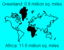
The issue is similar to the Greenland problem in geography. When using the most common projection for visualizing a round earth on a flat map, the Mercator projection, Greenland has a true shape but will look as being of same size as Africa, though Africa is over 10 times as large as Greenland.

As examined in the post Sharing data is key to a single version of the truth this is similar to the problems in fulfilling multiple uses embracing all business units in an enterprise:

  • If a map shows a limited part of the world the difference doesn’t matter that much. This is similar to fitting the purpose of use in a single business unit.
  • If the map shows the whole world we may have all kind of different projections offering different kind of views on the world having some advantages and disadvantages like when we do enterprise MDM.

Today we have new technology coming to the rescue. If you go into Google Earth the world indeed looks round and you may have any high altitude view of an apparently round world. If you go closer the map tends to be more and more flat.

Google EarthMy guess is that the solutions to fit the multiple uses conundrum within MDM also will be offered from the cloud by having innovative solutions reflecting the real world entities and relate those to a variety of business functions used in different business units offering a range of views that supports multiple purposes of use.

Bookmark and Share

AAA

A top theme in the economic news these days is about credit ratings for countries – also called sovereign credit ratings.

The credit rating practice is a good example of how a lot of data (with a given quality) is transformed into a very compact piece of information as an AAA or whatever rating (with a disputed quality).   

The focus of this blog post is however about how credit ratings may be attached to reference and master data entities.

The figure below is a data visualization of S&P credit ratings for European countries:

The big dark blue land in the upper left corner is the southern part of Greenland. Even though that Greenland has an ISO country code (GL) and an internet TLD (.gl) Greenland hasn’t actually been rated as a country, but is (my qualified guess) rated together with the Faroe Islands and continental Denmark as the Kingdom of Denmark.

On other maps Greenland isn’t included in the triple-A club:

So this is a good example of how a top level reference data list as a country list may have hierarchies and may be specific in a given context, a subject that often is pondered by fellow data geek and blogger Graham Rhind latest in the post: Have you checked your country drop down recently?

A much more frequent subject than sovereign credit rating is of course corporate credit rating.

Here we have the same hierarchical considerations.

A business-to-business (B2B) customer list may have a lot of entities belonging to the same enterprise that is credit rated as one. However you shouldn’t give a credit limit to each entity which would be the credit limit you would assign to the enterprise as a whole. Avoiding that will be an important result from practicing good customer master data management.   

An often observed data quality flaw in customer master data is that entities actually belonging to the same credit rated enterprise has different credit risk assignments resulting in exposed financial risk. Avoiding that will also be an important result from practicing good customer master data management.   

How do you rate your customer master data management? AAA or less?   

Bookmark and Share

Don’t confuse me with facts of life

As humans we like to know about simple facts. As with weather forecasts we like to know exactly what temperature it’s going to be, if the sun will be shining or it’s going to be rain and sometimes also about the wind speed and direction relating to a given place and time in the future.

Meteorologists have struggled for ages to tell us about that. A traditional weather forecast will tell us the best guess for these few key indicators.

Many people today, including me, don’t really rely on the weather to do our work. But we may plan when to work, how to get to work and what to do besides work depending on the weather forecast.

So I usually study the weather forecast. Lately I have noticed that the Danish Meteorological Institute has experimented with how to visualize to the common people that the weather forecast is a best guess. So for example instead of having single colored blue plies indicating how much rain to expect, they now have the choice to have blue piles in different light or darker blue colors indicating the risk (or chance if you like) of rain.

Better data quality? I think so. Less confusing? I think not. It could be rain anytime. But it probably won’t.          


Bookmark and Share

Data Quality and Data Visualization

This is a self-centric blog post about data quality and data visualization.

The figure to the right is a statistic about who viewed my profile in a certain period on LinkedIn.

Looking at that makes me think about a couple of data quality and data visualization issues especially linked to visualization of data on a world map.

Hidden value

Fortunately there is both a map and some numbers below, because the map is too small to show from where I have the most views: My very small home country Denmark.

Misleading proportions

I have no views from the grey countries. So I should certainly concentrate on Greenland (the big grey land in the top of the map) to get more viewers, right?

Well, the Mercator projections make areas close to the poles like Greenland look much bigger than in the real world. Greenland is a big island, but in fact only less than 1/3 of Australia (the almost as big light blue land in the down under right corner) – and Greenland only has 1/400 of the population of Australia.

Cultural dependency

My blogging and LinkedIn activities are in English due to the moderate population of Denmark. Therefore, and because of the spread of LinkedIn biased in the English speaking world, it’s no surprise most viewers are from English speaking countries.

Bookmark and Share