 This is a self-centric blog post about data quality and data visualization.
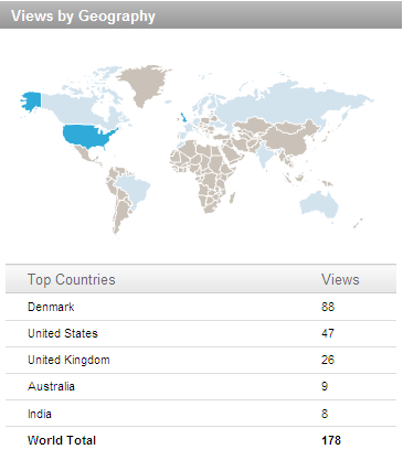
The figure to the right is a statistic about who viewed my profile in a certain period on LinkedIn.
Looking at that makes me think about a couple of data quality and data visualization issues especially linked to visualization of data on a world map.
Hidden value
Fortunately there is both a map and some numbers below, because the map is too small to show from where I have the most views: My very small home country Denmark.
Misleading proportions
I have no views from the grey countries. So I should certainly concentrate on Greenland (the big grey land in the top of the map) to get more viewers, right?
Well, the Mercator projections make areas close to the poles like Greenland look much bigger than in the real world. Greenland is a big island, but in fact only less than 1/3 of Australia (the almost as big light blue land in the down under right corner) – and Greenland only has 1/400 of the population of Australia.
Cultural dependency
My blogging and LinkedIn activities are in English due to the moderate population of Denmark. Therefore, and because of the spread of LinkedIn biased in the English speaking world, it’s no surprise most viewers are from English speaking countries.