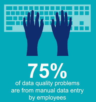
A recent infographic prepared by Trillium Software highlights a fact about data quality I personally have been preaching about a lot:
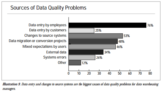
This number is (roughly) sourced from a study by Wayne W. Eckerson of The Data Warehouse Institute made in 2002:
So, in the fight against bad data quality, a good place to start will be helping data entry personnel doing it right the first time.
One way of achieving that is to cut down on the data being entered. This may be done by picking the data from sources already available out there instead of retyping things and making those annoying flaws.
If we look at the two most prominent master data domains, some ideas will be:
- In the product domain I have seen my share of product descriptions and specifications being reentered when flowing down in the supply chain of manufacturers, distributors, re-sellers, retailers and end users. Better batch interfaces with data quality controls is one way of coping with that. Social collaboration is another one as told in the post Social PIM.
- In the customer, or rather party, domain we have seen an uptake of using address validation. That is good. However, it is not good enough as discussed in the post Beyond Address Validation.
![]()

That chart adds up to way more than 100% of #dataquality problems which is a problem in and of itself. Chart needs better labels to explain how data was gathered. I assume a survey that allowed respondents to check multiple options. ( I assume it is explained in the text of the 2002 article)
You are right Chuck. Perhaps that’s why Trillium came to 75 %.
Another ironic point is that in the infographic about data quality, Trillium states that the date on the TDWI report is 2012, when it is actually 2002.
I have to say that the chart is very true when it comes to sources of data quality problems.